NHG
Visualisation H&W
PROJECT
Huisarts & Wetenschap
(General Practitioner & Science)
CLIENT
Nederlands Huisartsen Genootschap (The Dutch College of General Practitioners)
PRODUCT
Various (data) visualisations, illustrations, and layouts for the monthly magazine ‘Huisarts en Wetenschap’ (H&W, General Practitioner and Science)
YEAR
2023
In short
The Dutch College of General Practitioners (Nederlands Huisartsen Genootschap, NHG) has been publishing its monthly magazine ‘’Huisarts & Wetenschap’’ (General Practitioner & Science) since 1957. This magazine, intended for all general practitioners in the Netherlands, contains background information, research articles, and in-depth coverage of various topics relevant to its readers. The magazine provides notable data, outcomes, guidance, and new guidelines and practices.
Clear and visually appealing
As the title of the monthly magazine suggests, it aims to be a link between the general practitioner and science. General practitioners are often focused on practical matters. They are hands-on professionals with a busy schedule. The magazine wanted to pay more attention to data visualisation and illustrations to fulfil its intermediary role better. Studio Wiegers was asked to partner in presenting research and data in the clearest, most intuitive, and visually appealing way possible.
“I have the highest respect for the way in which, not only the research, but also the final message has been incorporated into the infographic based on existing evidence from literature, thus making the article much more attractive.”
Ariëtte R.J. Sanders e.v. van Lennep • General practitioner, epidemiologist, editor of ‘General Practitioner and Science’.
Communicating data in the right way
The data provided in research studies usually comes directly from the researchers/authors. They often prove challenging to understand when presented in their entirety, in a table or graph without explanation. We have supported H&W in taking the necessary steps to communicate them more effectively. Our task is to translate raw data into relevant and engaging figures and articles which captivate general practitioners. This approach enhances the message’s impact.
We frequently collaborate with Sara Sprinkhuizen (the Data Vision Lab) and magazine manager Judith Mulder (NHG) when developing visuals. In this collaboration, there is ample room for discussion. There is often a dynamic interaction between the parties involved, leading us to achieve the best possible results.
Delivered value
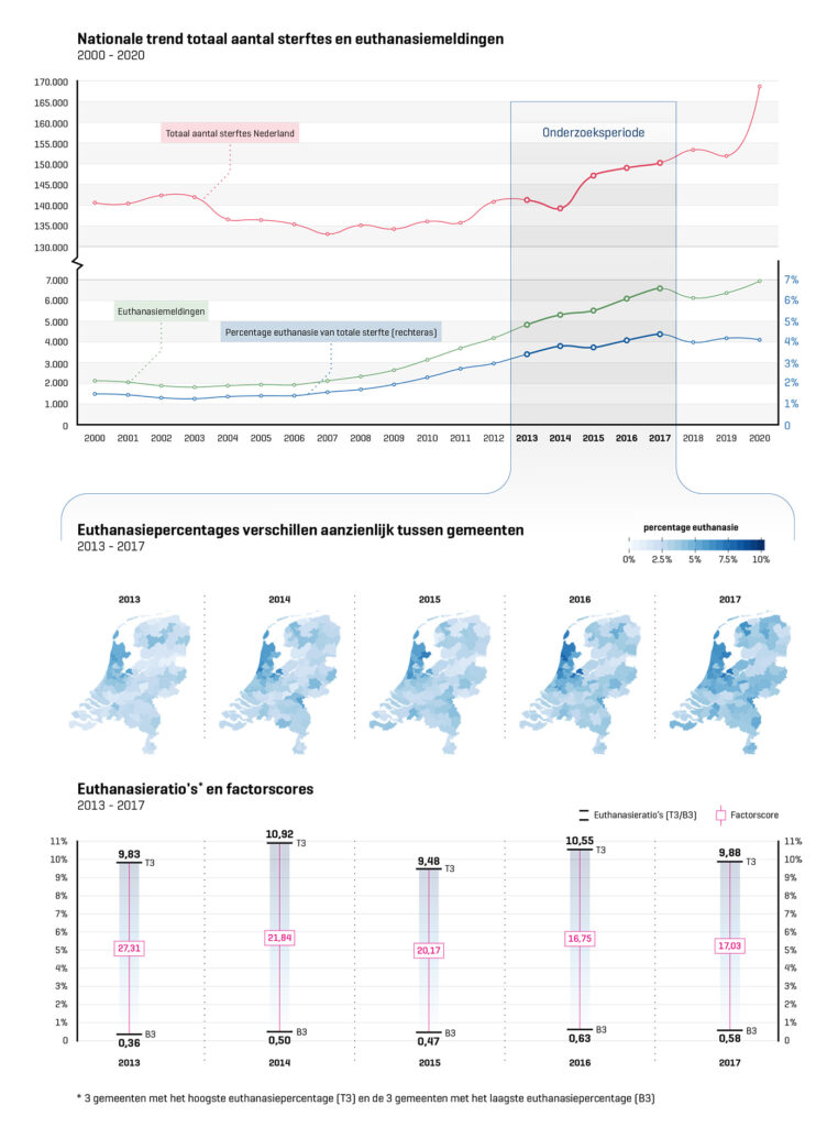
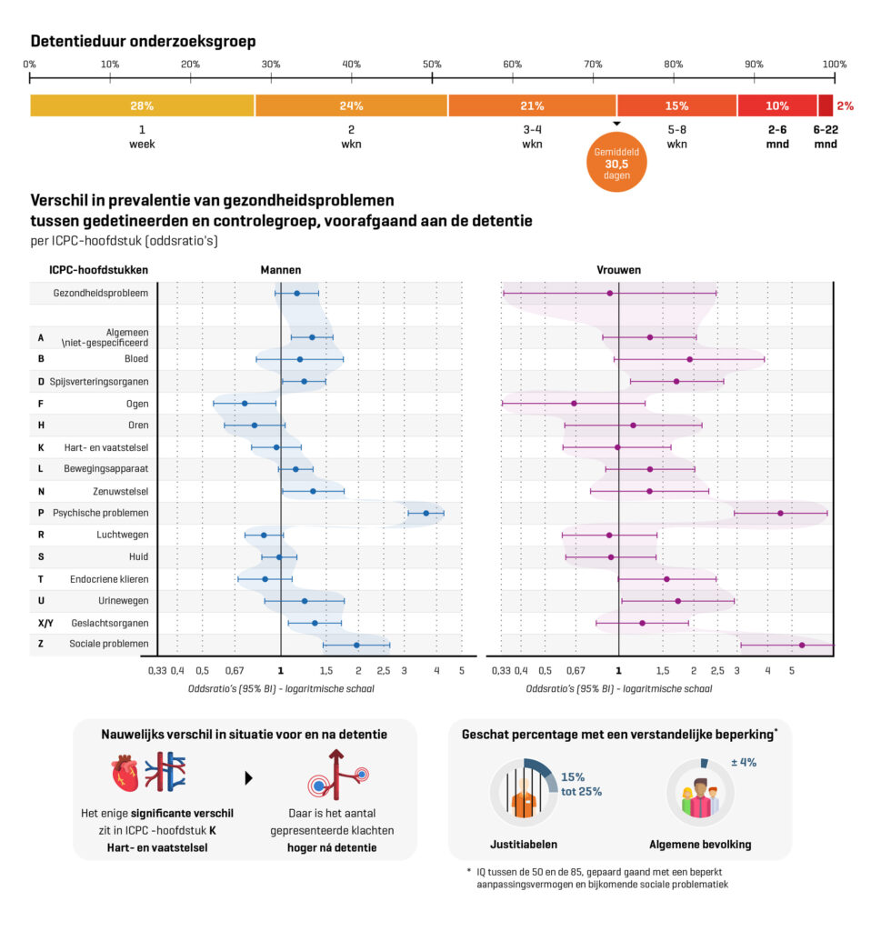
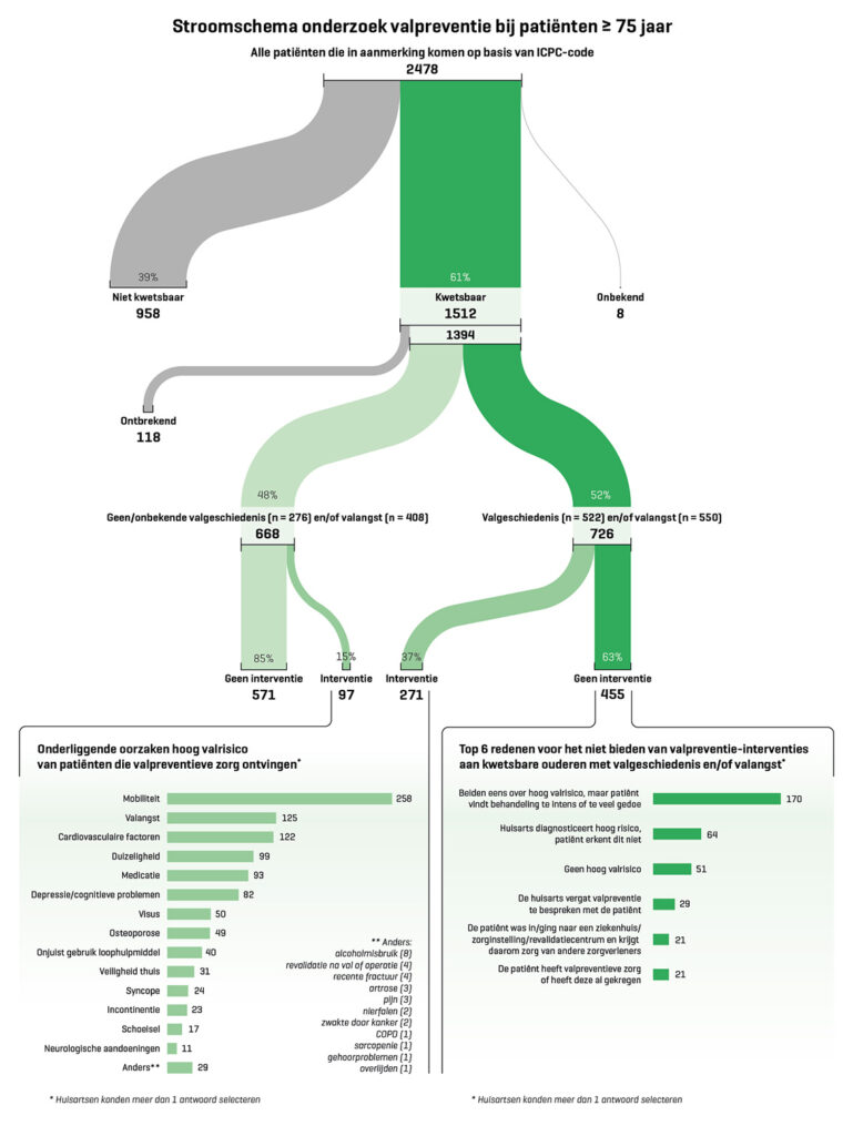
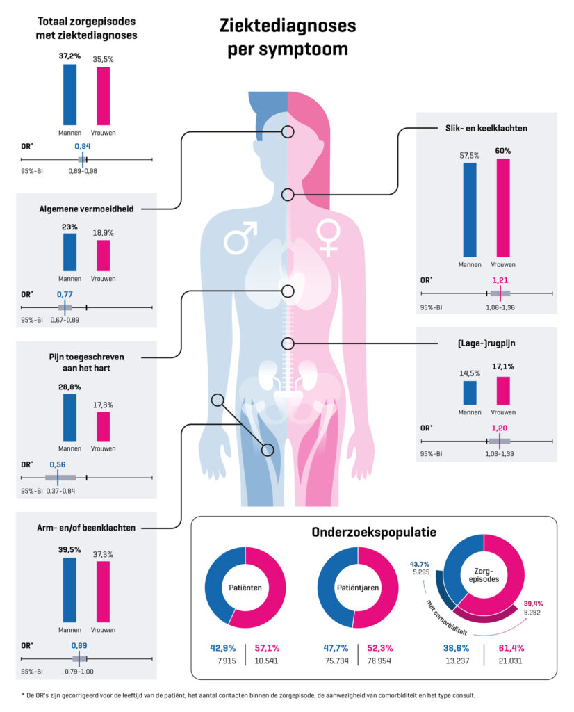
As seen on this page, we work with various visual solutions. Firstly, the category of graphs, charts, flowcharts, and figures represents the most concrete form of data visualisation. The key here is to find the correct format that best conveys the message. Regarding figures, we consider colour, spacing, scale, breaks, and aesthetics. This is done to strike a good balance between attractiveness, readability, and accurate data representation.
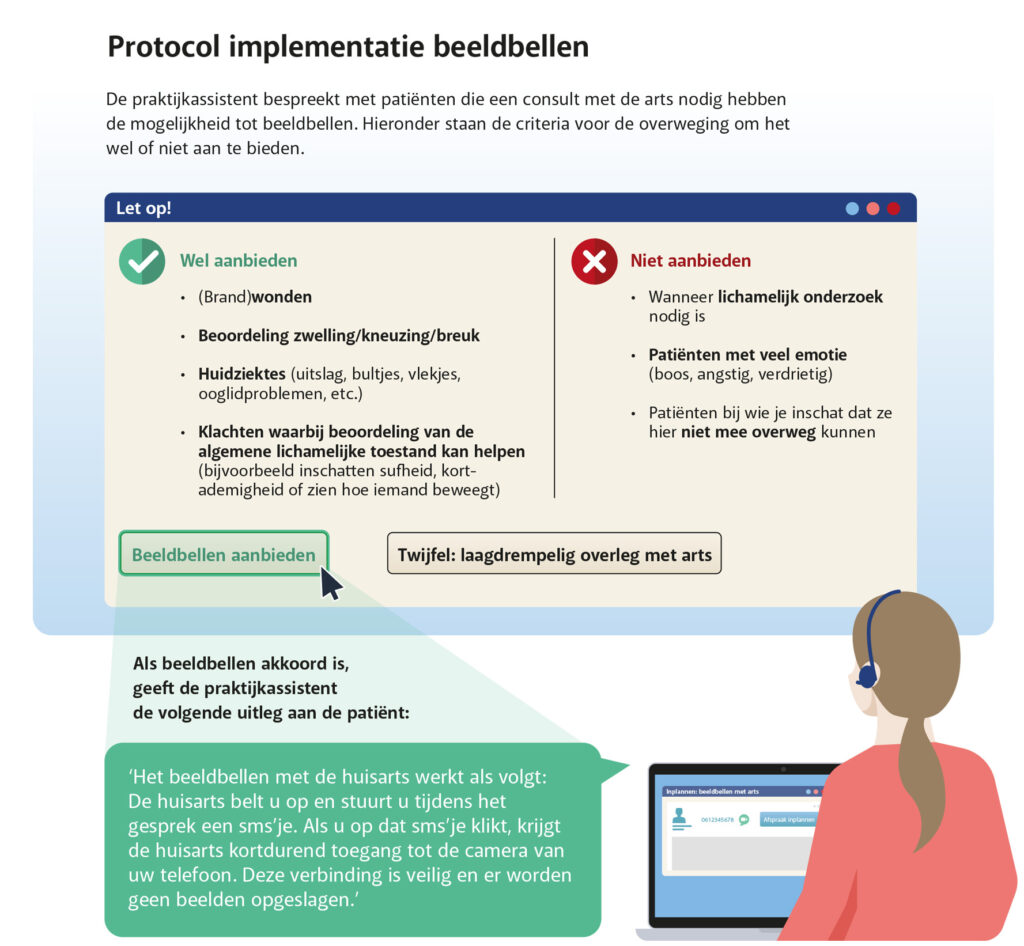
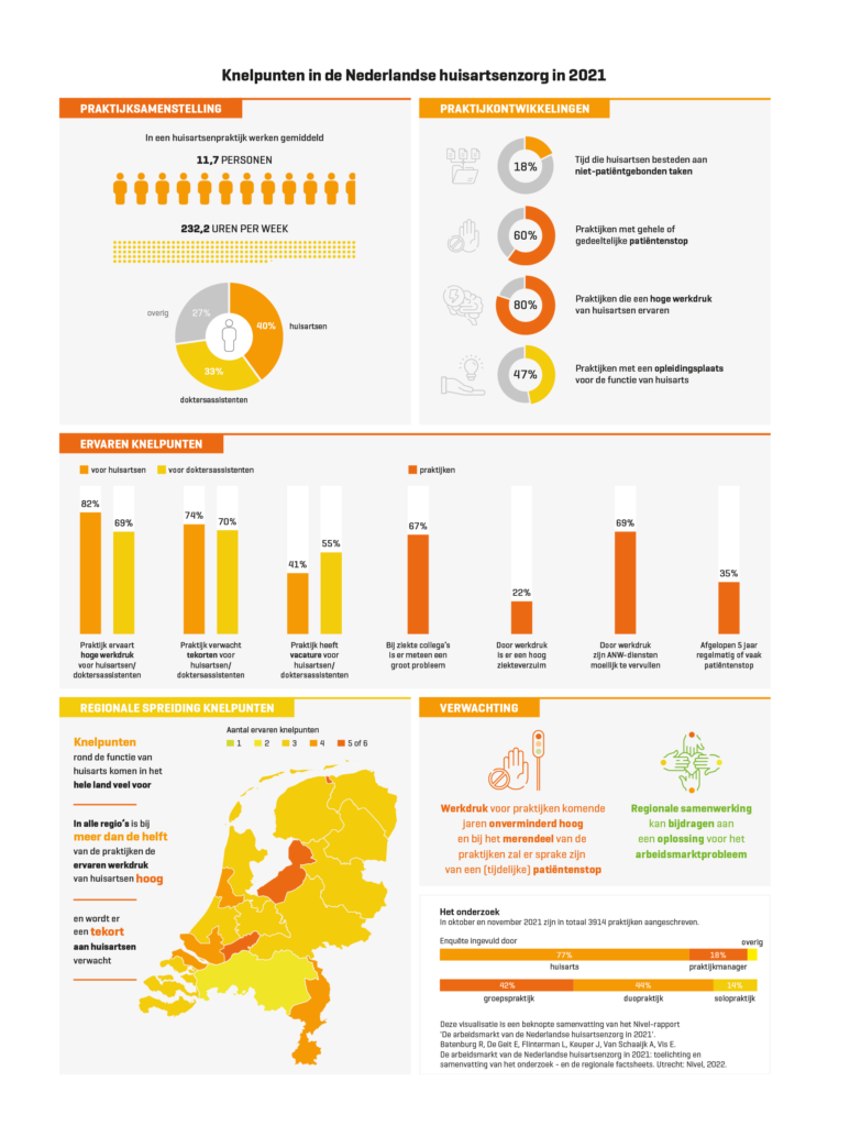
The second category includes infographics and explanatory figures for models and actions. Finally, there is a category of creative interpretation and visualisations in alignment with a subject or article. It primarily focuses on presenting the data and the message attractively. The image should stimulate the recipient and invite them to explore the information further. Below is a selection of graphics we have created for the magazine most recently.


“My compliments for the beautiful layout of the article! Truly, well-designed. It’s clear, with colours matching that of the HALL framework and the heading of the text. So yes, I share your enthusiasm.”
Dr. Sietske Grol • Policy Advisor Transmural Care – Corporate Staff Strategy Development – Researcher – Primary Care Medicine | AMPHI.
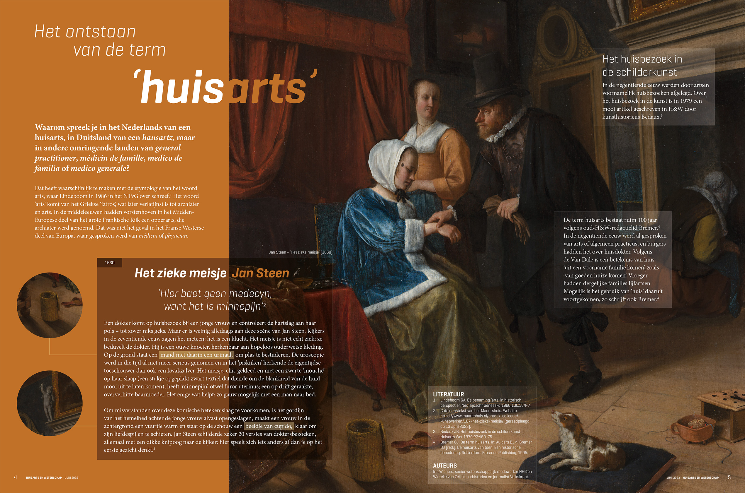
A double page from H&W, about the ‘Origins of the General Practitioner.